UI/UX case study
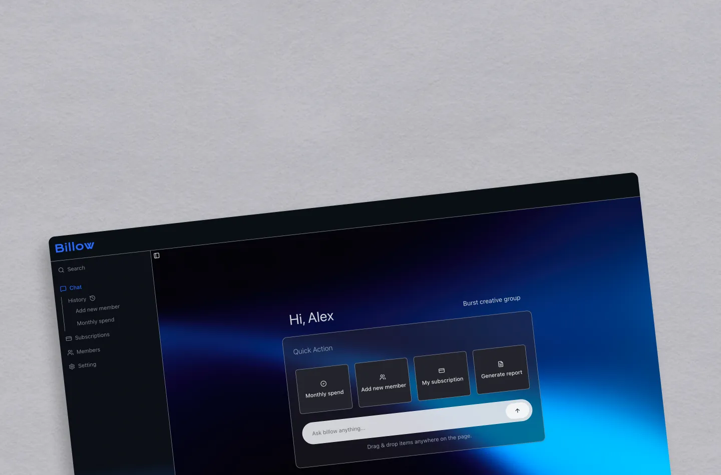
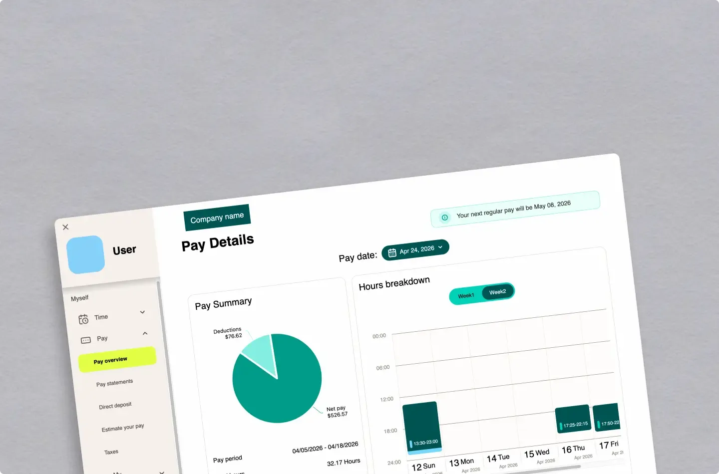
UKG Payroll Verification Redesign
Researched and redesigned the payroll verification experience for UKG, based on real user interviews and feedback
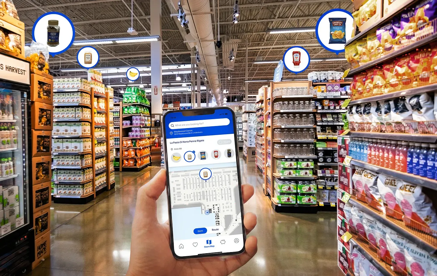
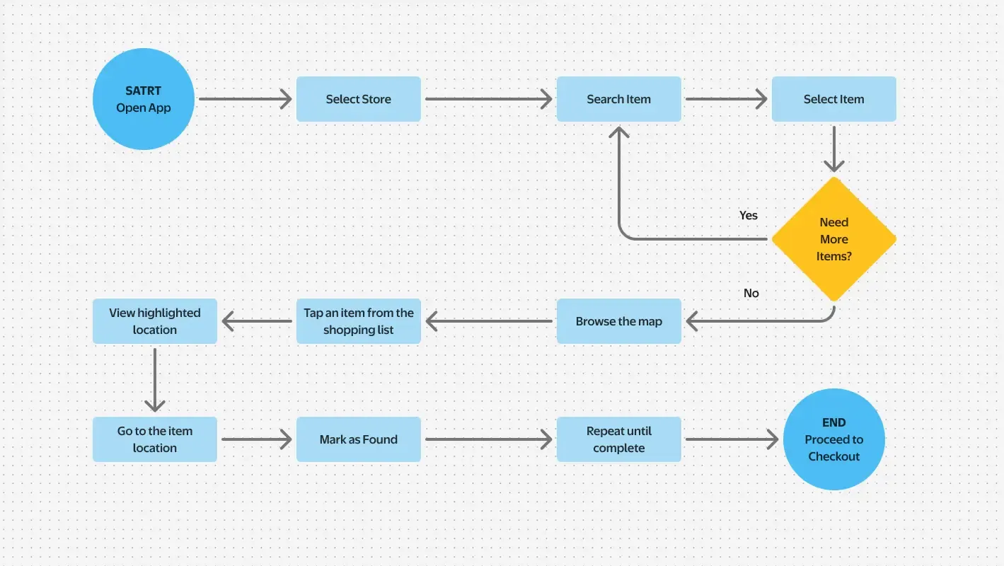
Rethinking grocery shopping with interactive store maps and intuitive product discovery.
About this project
Main objective
Help shoppers in large supermarkets quickly find the products they need, reducing time spent wandering through unfamiliar aisles.
Project highlight
Designed, built, and validated an interactive grocery navigation experience through user-centered design, AI-assisted workflows, and React Native development.

Designed an additional Walmart app feature to gain experience working within an enterprise design system.
Built an AI-assisted design-to-code workflow using Claude Code and Figma MCP.

Built a functional React Native prototype and conducted user testing to validate real-world interactions and usability.
Background
While working at a supermarket, I frequently saw customers struggling to find products in large stores with thousands of items. Even when the products were available, many customers left without finding them, highlighting the need for a better in-store navigation experience.
Design Goals
As a grocery shopper, I want to easily find the products I’m looking for, so that I can shop without getting lost.
Theme
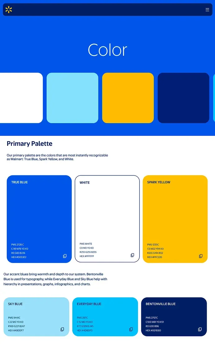
A design system is more than a collection of reusable components. It provides the shared language that allows new features to feel like a natural extension of an existing product.
To explore this idea, I intentionally designed a Store Map feature that doesn't exist in Walmart today. The challenge wasn't creating something new. It was creating something new that still "felt like Walmart."
Constraint
The internal UI components, design tokens, and implementation details were not accessible. Instead of attempting to replicate the private design system, I focused on preserving the brand’s visual language while creating a scalable foundation for new components.
Decision
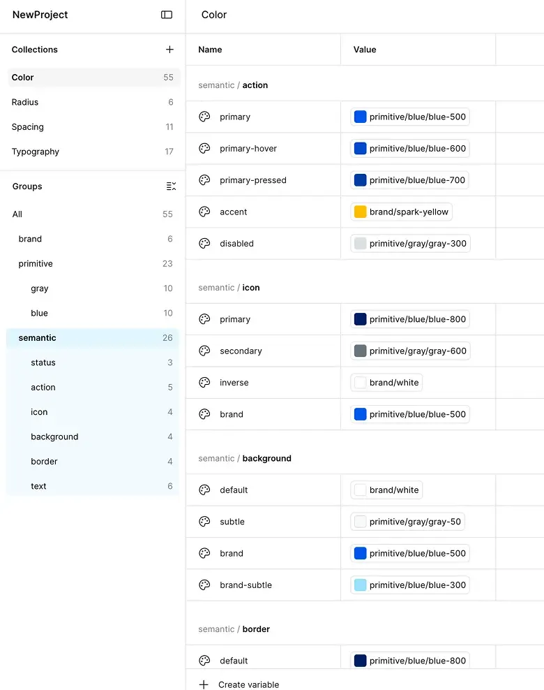
Instead of applying brand colors directly to components, I introduced semantic tokens to make new UI patterns reusable and easier to maintain.
Application
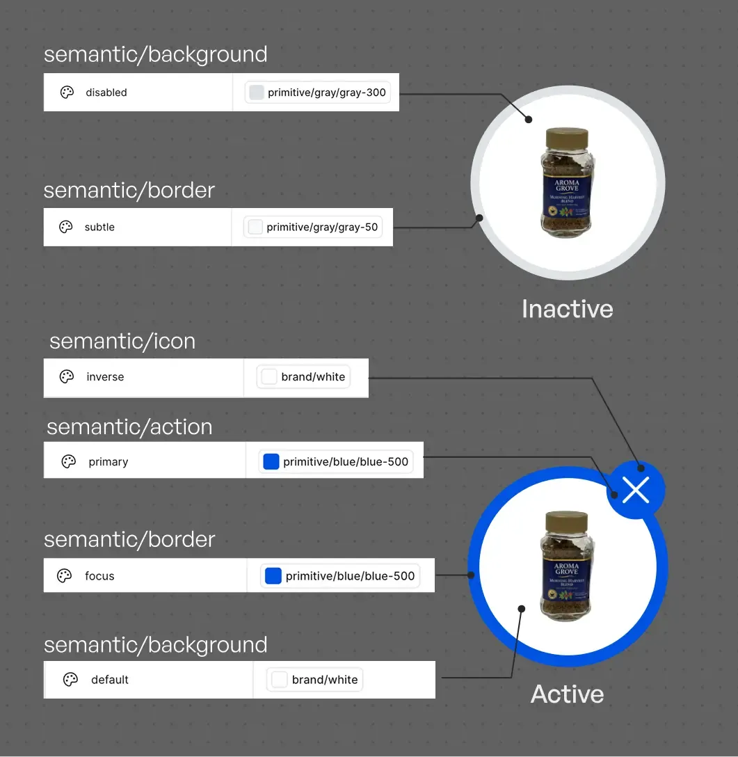
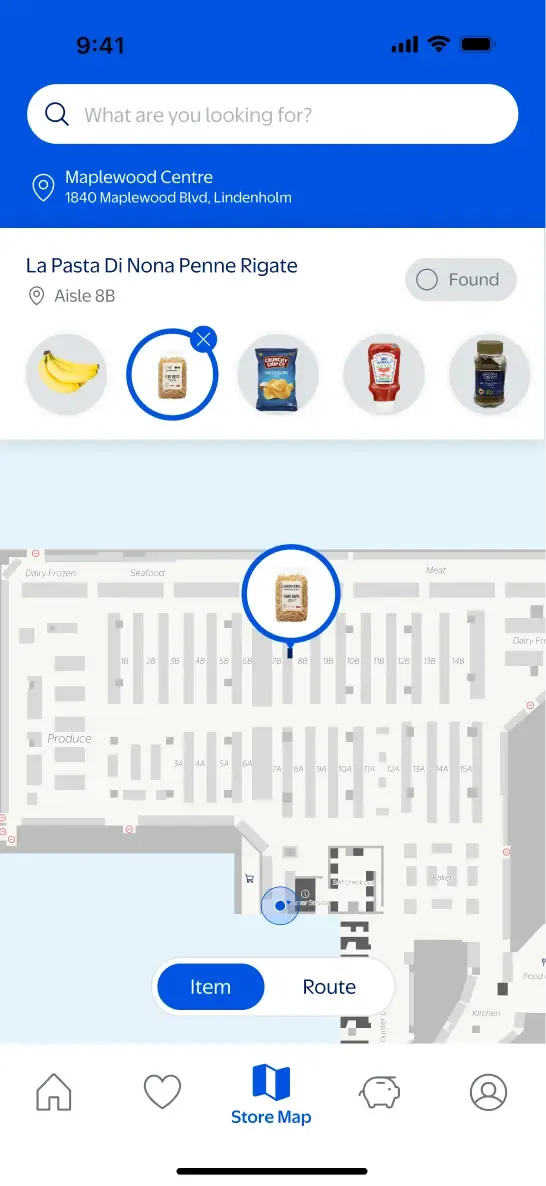
Using the token system, I built reusable components such as Item Pins and Item List Icons that were applied consistently throughout the Store Map experience. This allowed new interactions to feel native to Walmart’s existing visual language without copying its internal design system.
Objective
The goal was to help shoppers find products without getting lost in the store. Using the layout of the store where I work, I accurately recreated its aisles and product areas.
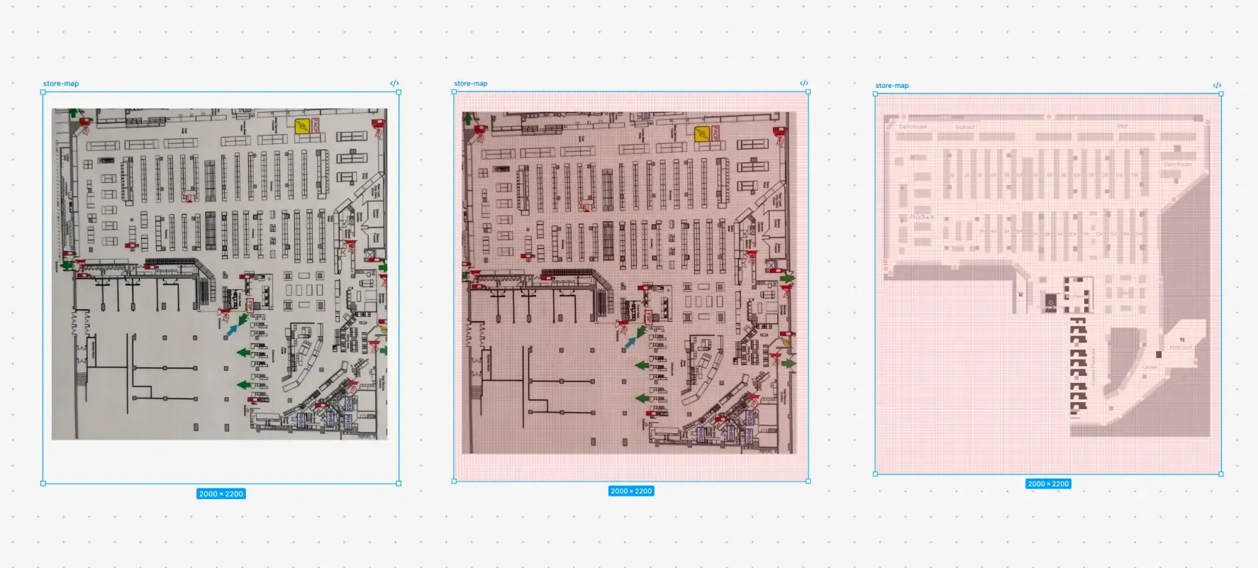
To create a clean, structured SVG, I overlaid an 8 × 8 px grid on the original floor plan and traced each section cell by cell.
Design to Dev
To make the map interactive, each area needed to be accurately connected to its product data. I introduced an AI-assisted workflow to streamline this repetitive process.
Challenge
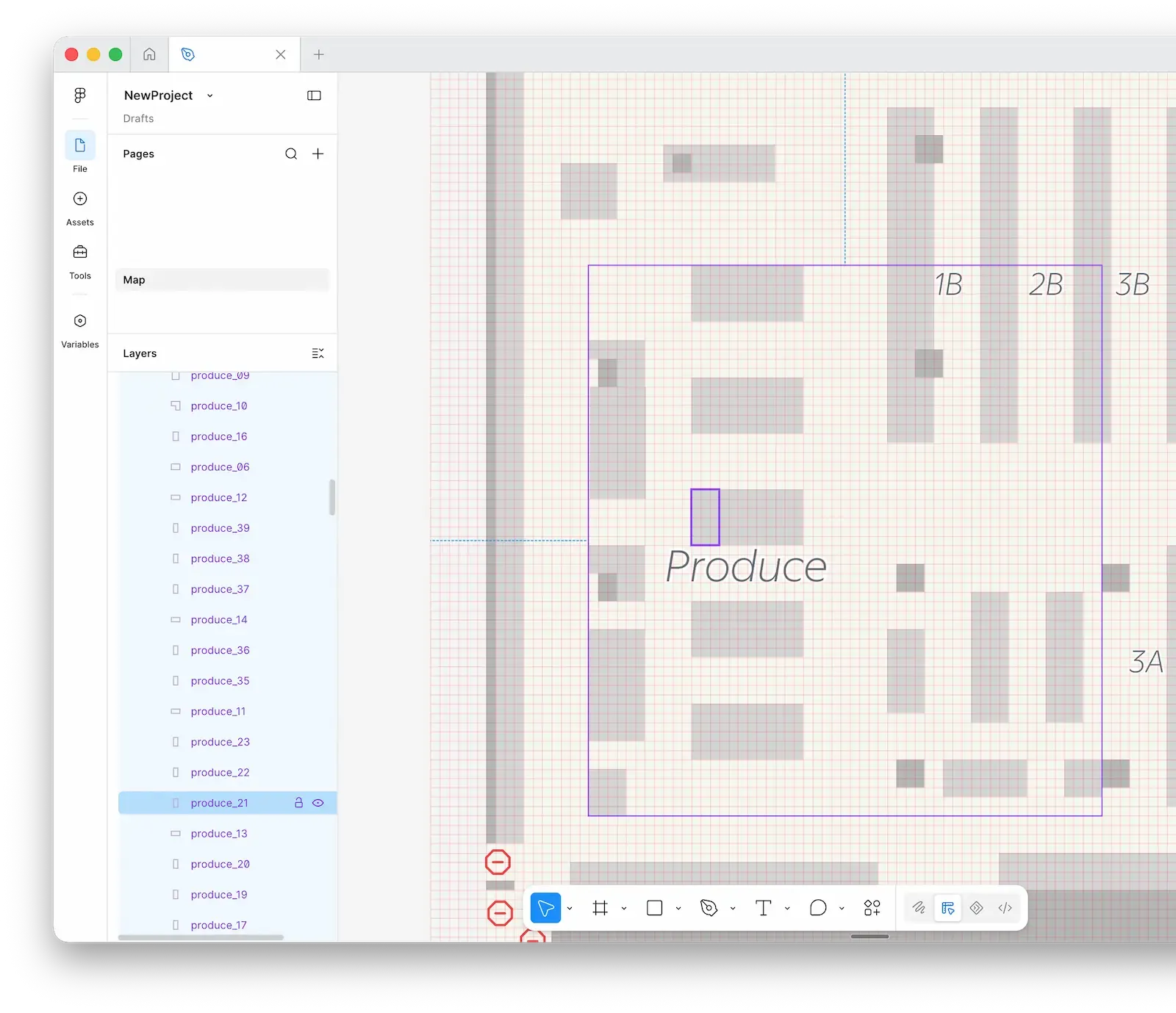
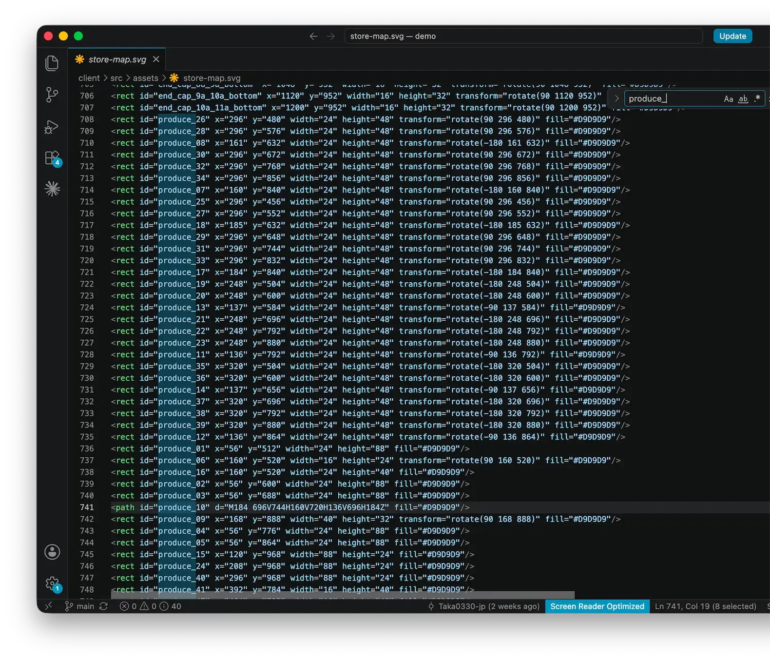
Connecting products to their locations required a unique ID for every map element. Naming hundreds of elements manually would have been time-consuming and prone to errors or duplicates.
Solution
I created a naming convention based on product category and location, then used Claude through Figma MCP to apply it to each layer. The layer names could then be used directly as SVG IDs, creating a smoother handoff to development.
Outcome
The workflow reduced repetitive work and improved naming accuracy. It also made the transition from Figma to development more efficient.
Design Challenge
While navigating the store, shoppers need both a clear view of the map and quick access to their shopping list. However, maximizing one often compromises the other. To identify the better experience, I explored two navigation patterns and validated them through usability testing.
Design Trade-off
Pattern A
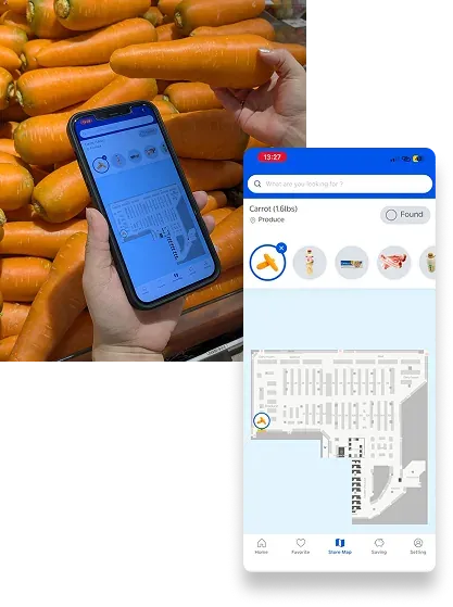
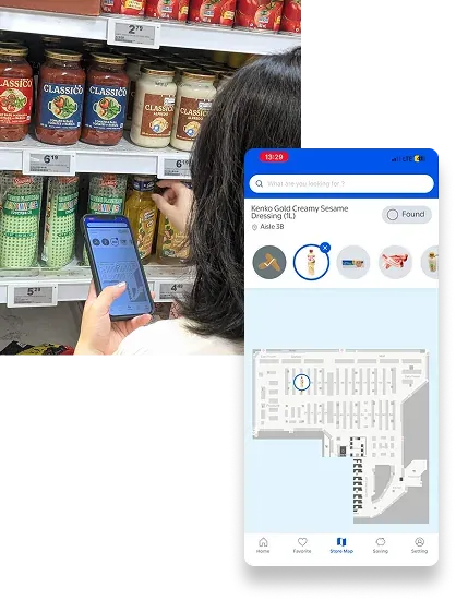
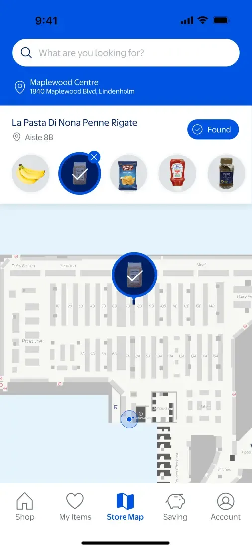
The Header List keeps shopping items constantly accessible, enabling faster switching between products while slightly reducing the visible map area.
Faster item switching
View the map and shopping list simultaneously
Less map space
Pattern B
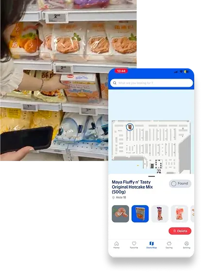
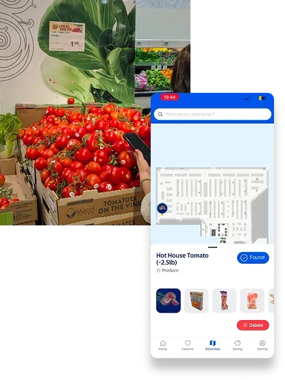
The Bottom Sheet prioritizes map visibility by allowing the shopping list to be hidden when it’s not needed.
Maximized map visibility
On-demand shopping list
Map is partially obscured when expanded
Usability Test
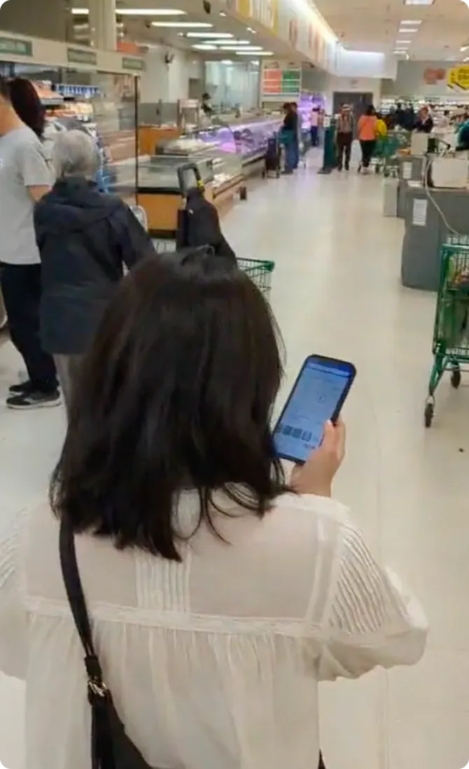
The participant was asked to locate six grocery items, switch between products, mark items as found, and navigate using the store map. During the sessions, I observed not only which interface participants preferred, but also how frequently they switched items, reopened the shopping list, and interacted with the map throughout the task.
Task: Find five products using Pattern A and five using Pattern B. Store Map.
Design Decision
Although the Bottom Sheet provided a larger map, participants switched between shopping items more frequently than they viewed the map in full screen. The Header List reduced unnecessary interactions, kept products readily accessible, and supported a smoother shopping experience. Based on these findings, it became the final interface.
This project taught me that the quality of a design is defined not by the number of possibilities, but by the ability to prioritize within constraints. By working through 1. Design Constraints and trade-offs, I learned to evaluate decisions based not on visual novelty, but on reusability, implementation feasibility, and their impact on the user experience.
I also realized that while AI has significantly accelerated the process of turning ideas into tangible solutions, speed alone has little value. What truly matters is using that extra time to validate assumptions, iterate on ideas, and make better-informed design decisions. This experience changed my understanding of efficient design. It is not about reducing effort. It is about spending more time on the decisions that create the greatest impact.