Stone & Honey brand presentation hero image

ナッツバターのブランディングデザイン課題。

与えられたテーマは、「素材のありのままを、まっすぐに届けること」。余計な砂糖やオイルを加えず、ナッツ本来の風味を生かす姿勢。産地の透明性や季節のブレンドを通して、素材にこだわる人々に信頼されるブランド。

使用ツール
PsAiDn
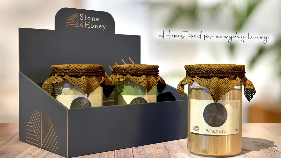
Stone & Honey jar packaging displayed in a branded countertop box

ターゲットは、食や健康への意識が高い25〜50歳の男女。購入前に原材料や産地、製法を確認し、価格よりも素材の純粋さや作り手の誠実さ、確かな品質を重視する人々です。

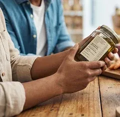
Customer reading the label on a Stone & Honey jar

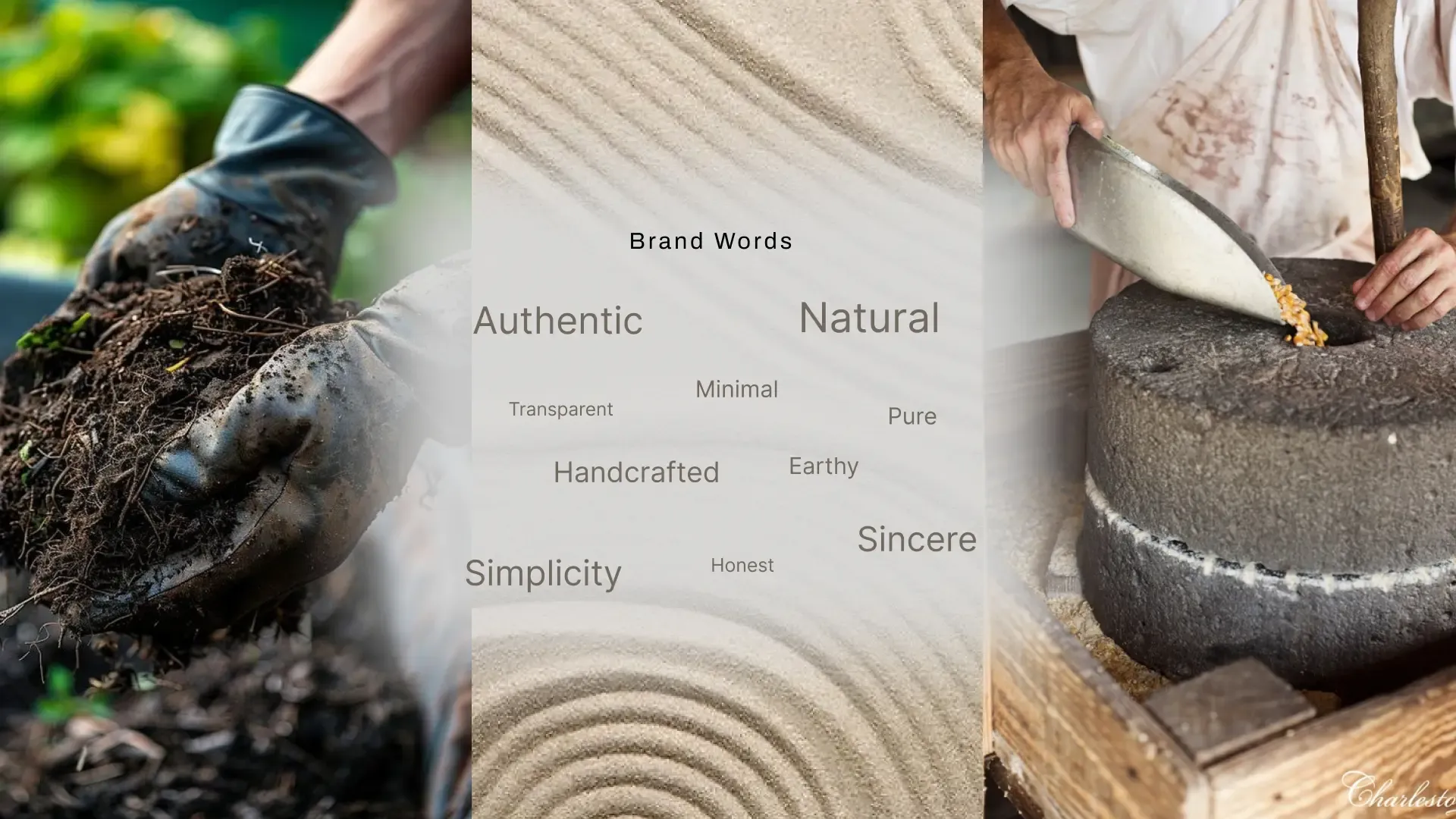
Keywords

Brand word map: authentic, natural, minimal, transparent, pure, handcrafted, earthy, simplicity, honest, sincere

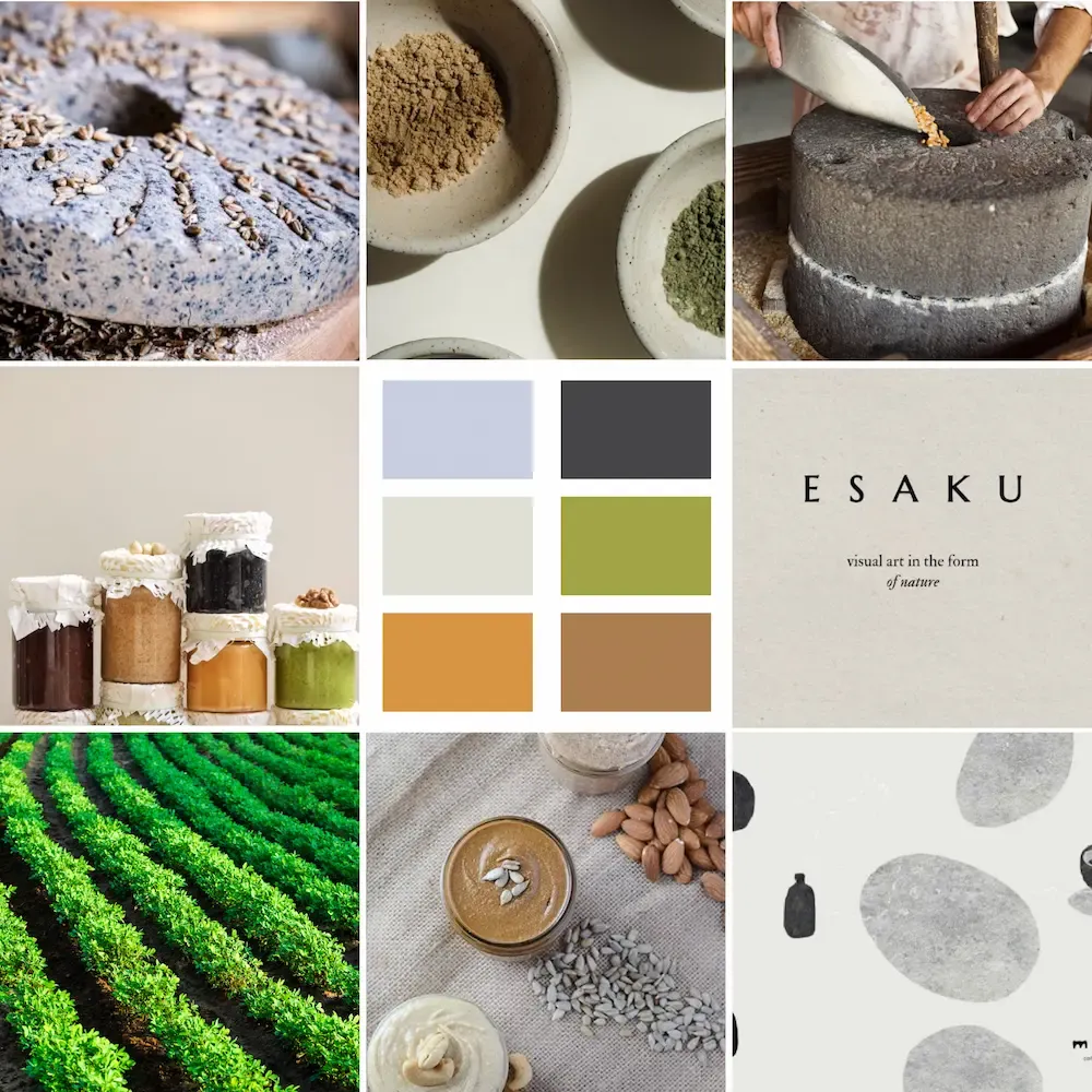
Mood board

Stone & Honey mood board
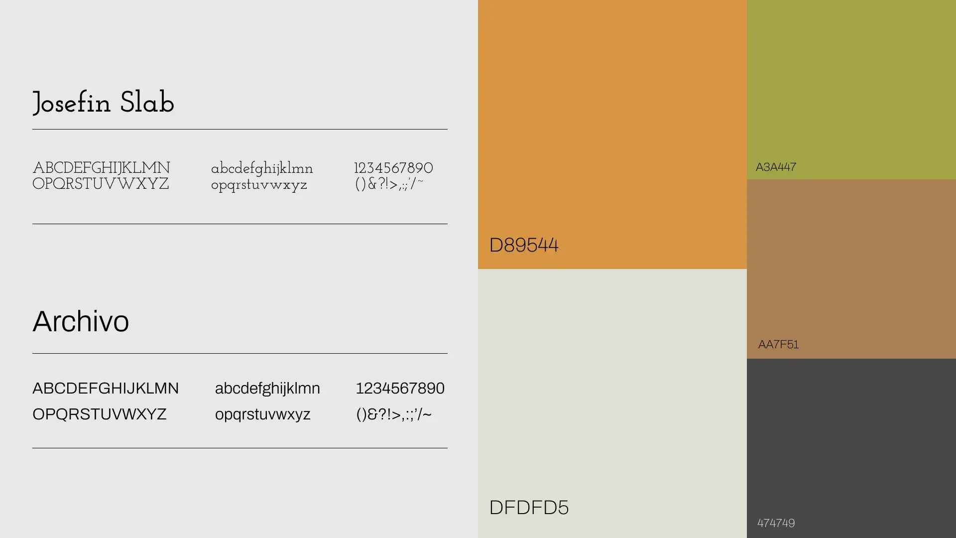
Stone & Honey typography (Josefin Slab, Archivo) and color palette

Logo directions

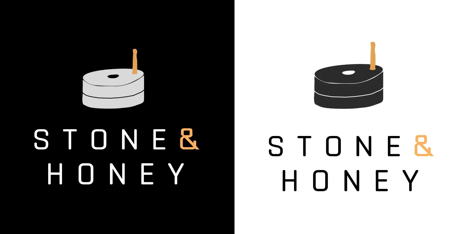
1Logo direction 1: candle icon mark with Stone & Honey wordmark
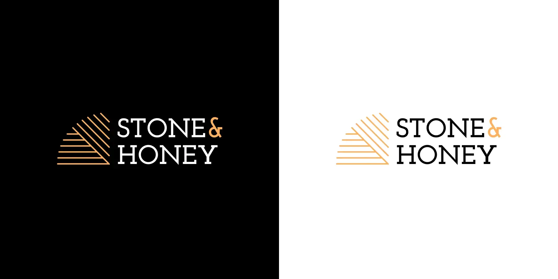
2Logo direction 2: mountain line mark with Stone & Honey wordmark
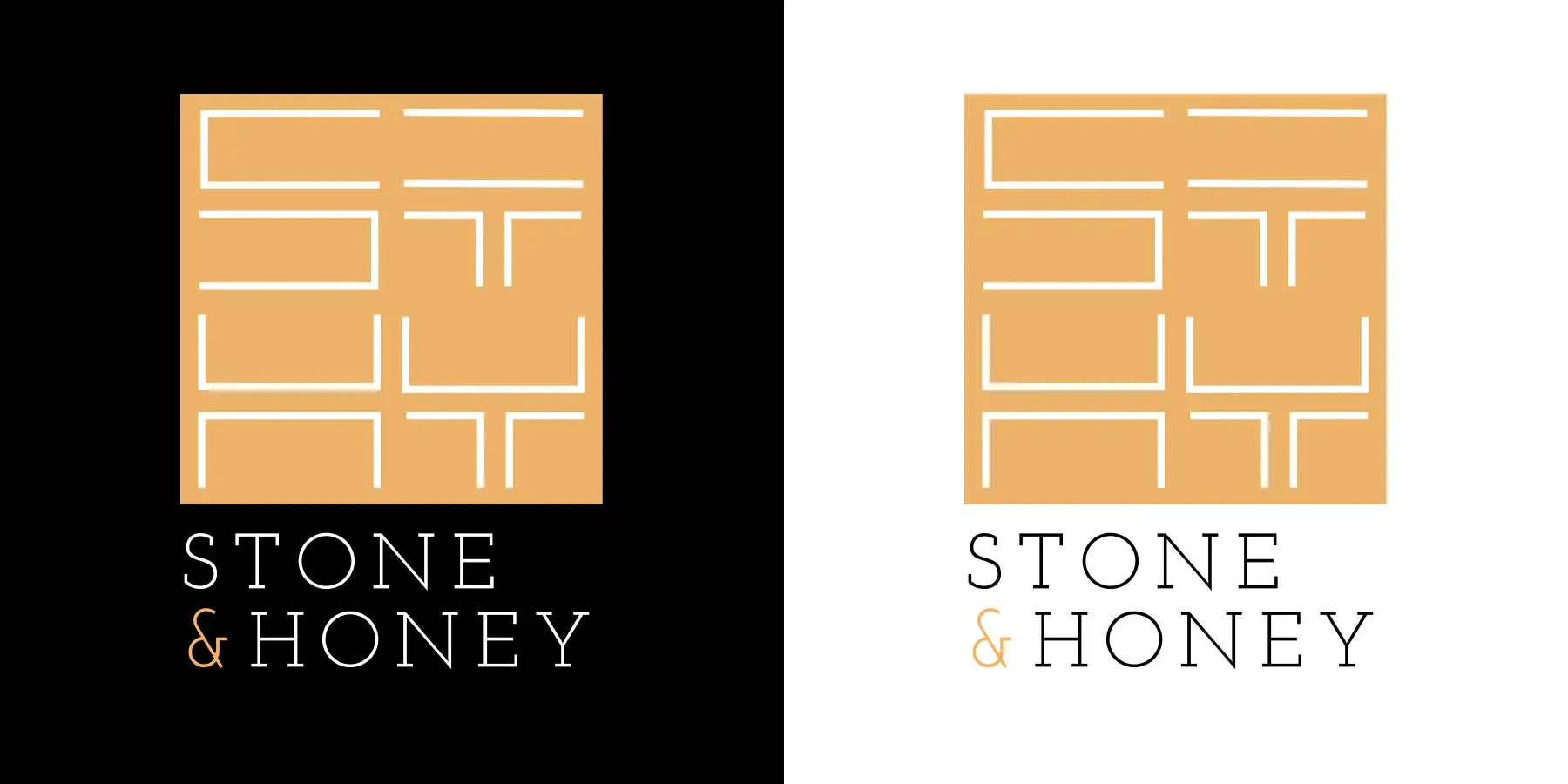
3Logo direction 3: ST monogram grid mark with Stone & Honey wordmark

Final design

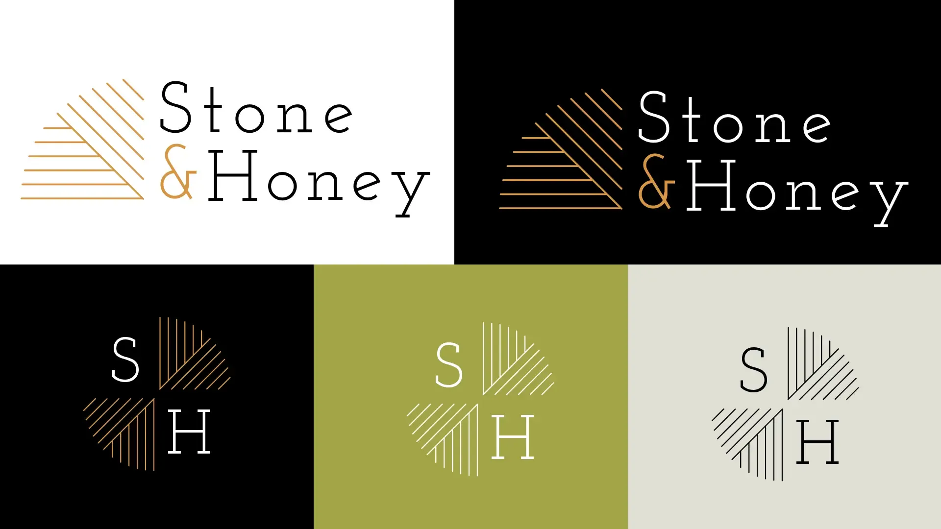
Final Stone & Honey logo system: wordmark and SH monogram across light and dark backgrounds
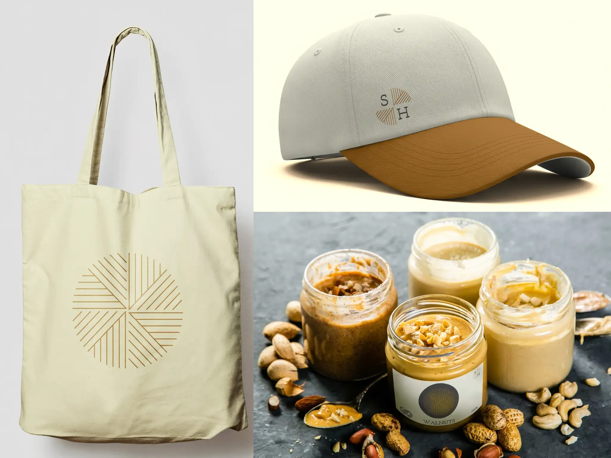
Stone & Honey merchandise mockup: tote bag, cap, and jars
一覧に戻る

その他のプロジェクト

給与確認アプリのリデザイン
UI/UX ケーススタディ

給与確認アプリのリデザイン

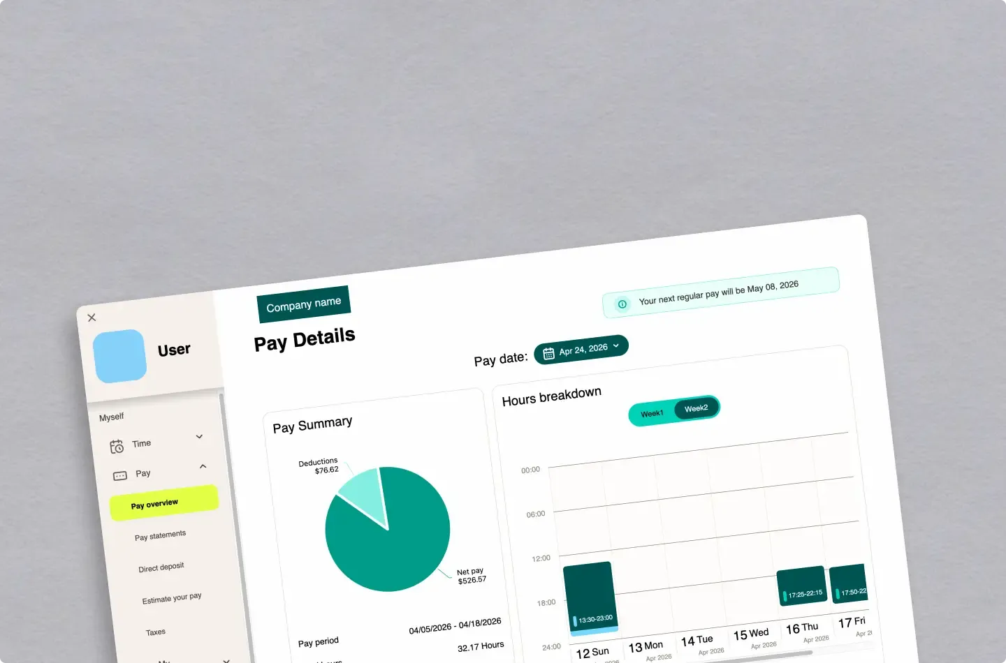
実際のユーザーインタビューとフィードバックをもとに、給与確認体験を調査・再設計しました。
Billow
Web開発

Billow

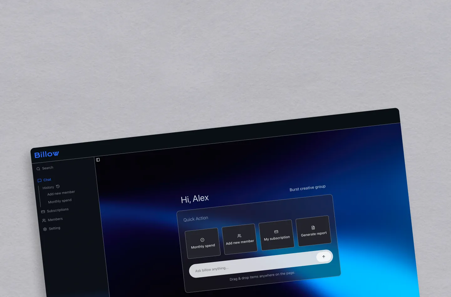
会話型UIとチャット体験の設計に重点を置いた、Next.js製のサブスク管理ダッシュボードです。